UI/UX Overhaul and Redesign for Ark’s Inventory and Player Systems
For Studio Wildcard, I produced a UX redesign of ARK’s HUD and Inventory streamlining key interactions. The work earned praise from senior designers in feedback rounds.
Ark: Survival Evolved is a 2017 action-adventure game by Studio Wildcard where players survive on maps filled with dinosaurs, fantasy creatures, prehistoric animals, natural hazards, and hostile players.
1. Analyze the current HUD design
I analyzed Studio Wildcard's prototype HUD and Inventory screens using Usability Heuristics, identifying key user pain points.
After identifying the pain points, I created a user flow and information hierarchy map to address and resolve the issues.
2. Wireframes and Prototyping a solution.
I developed a fully functional prototype showcasing the proposed solution, highlighting improvements and key features to enhance the HUD and Inventory System.
Analyzing the Current Design
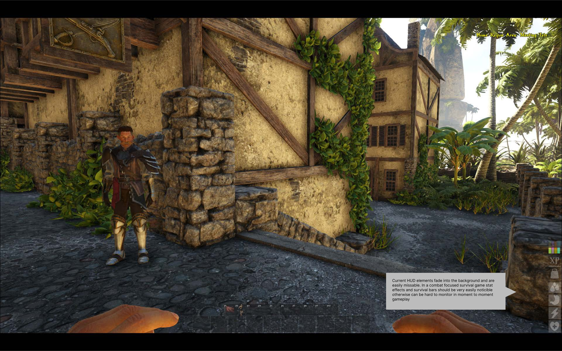
HUD
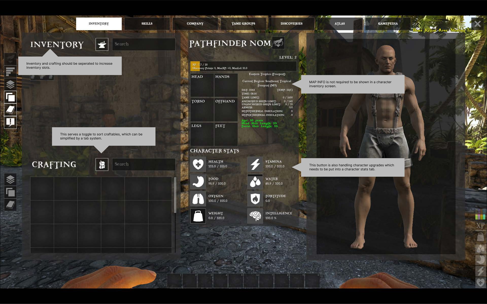
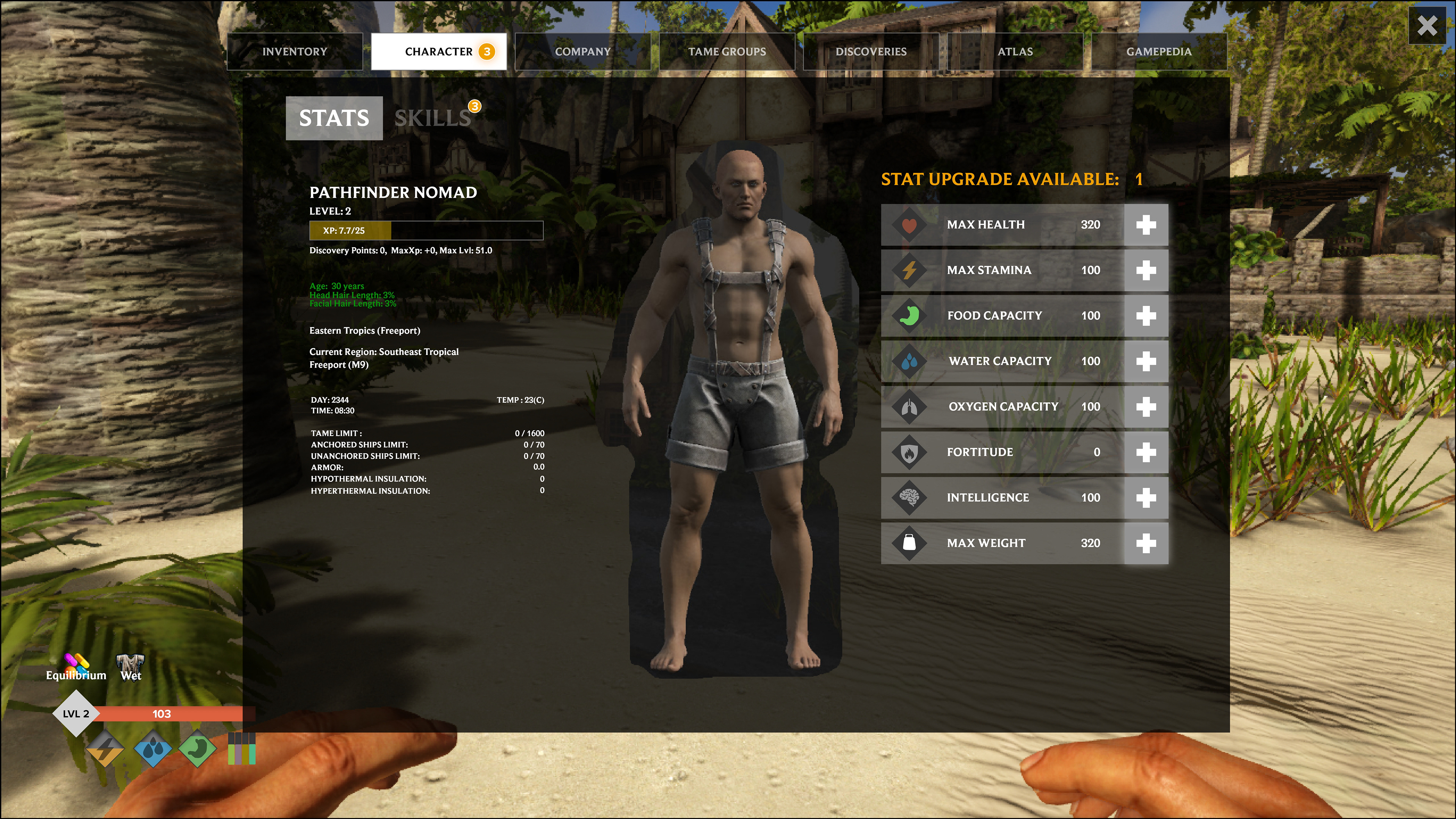
CHARACTER - INVENTORY
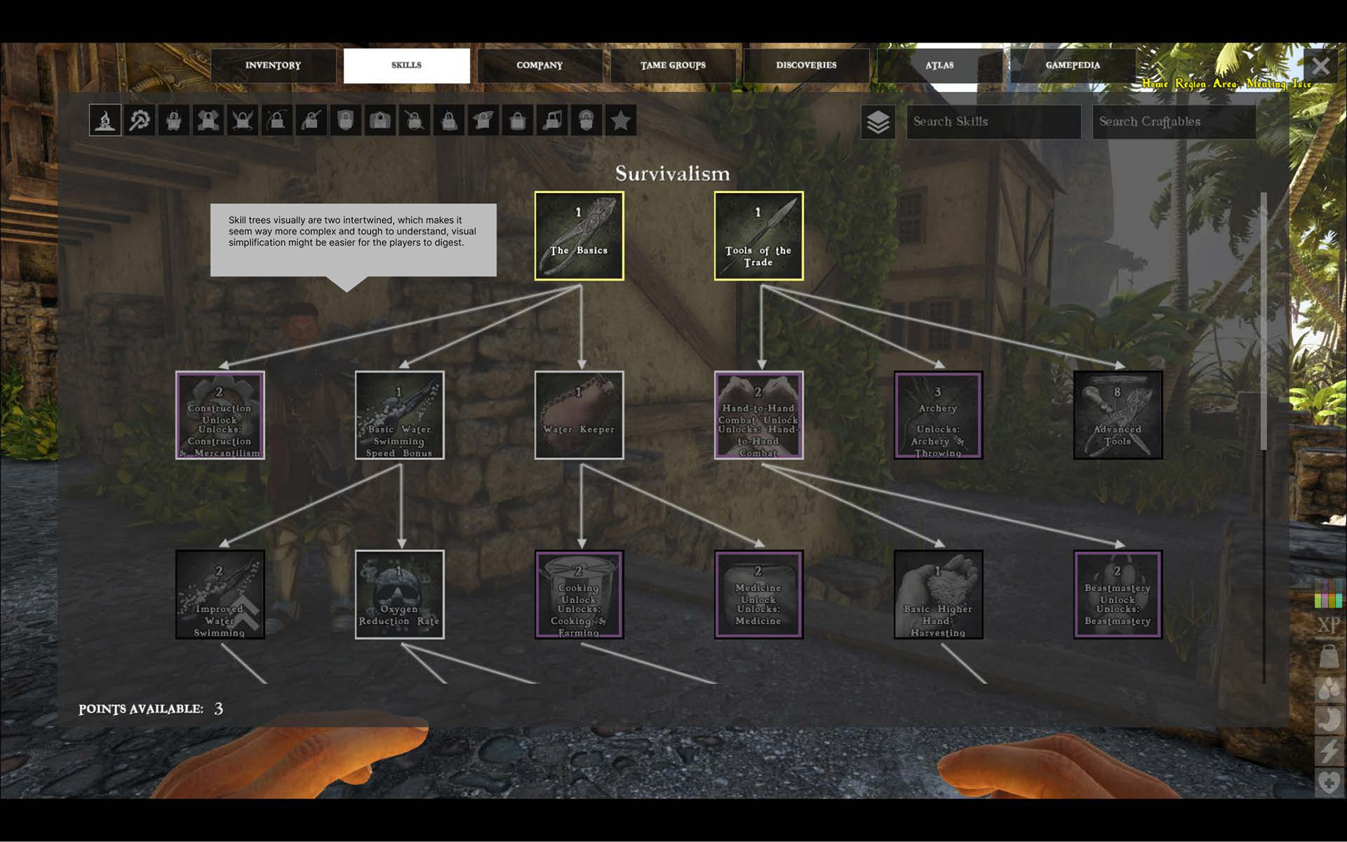
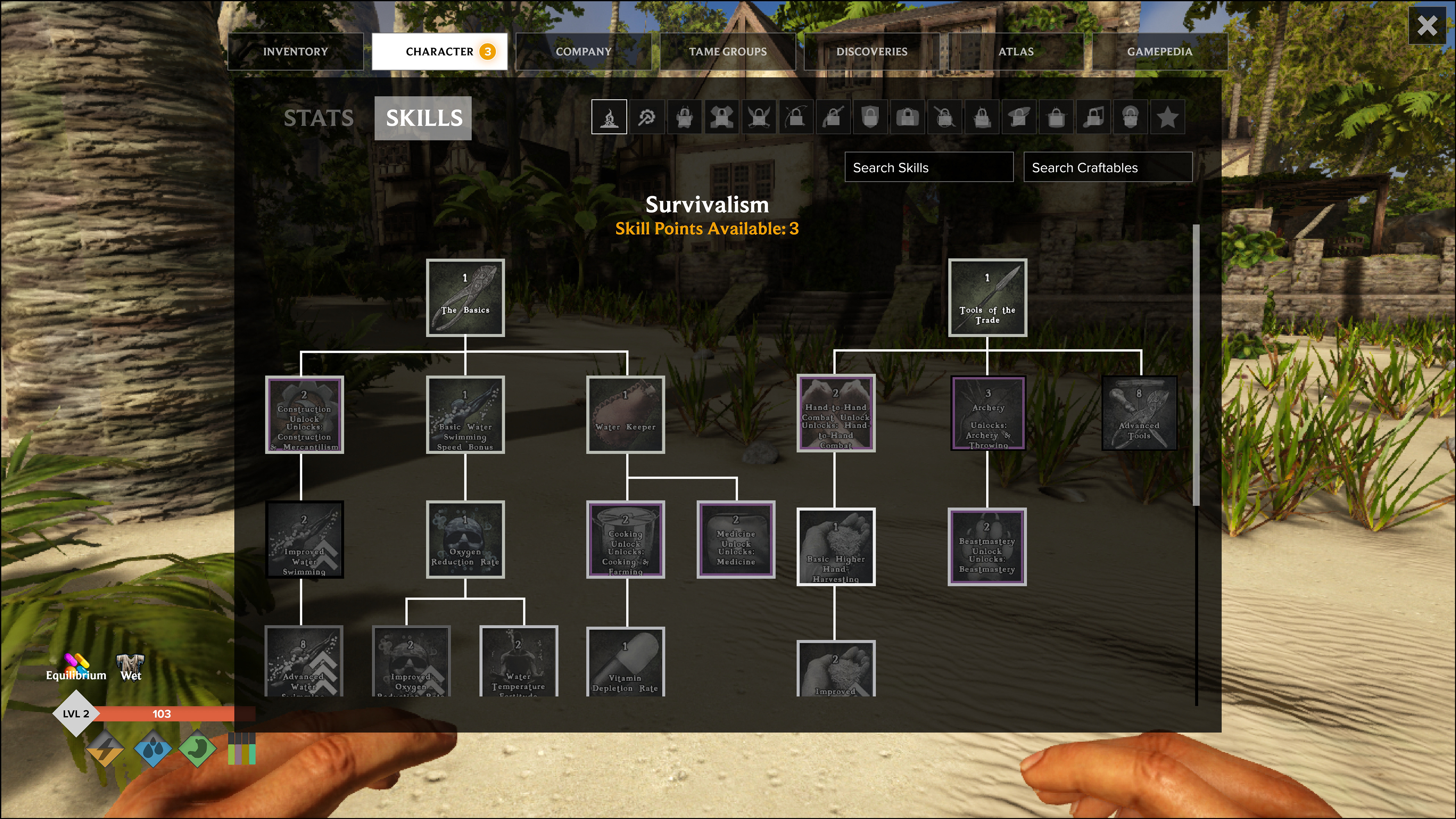
SKILL TREE
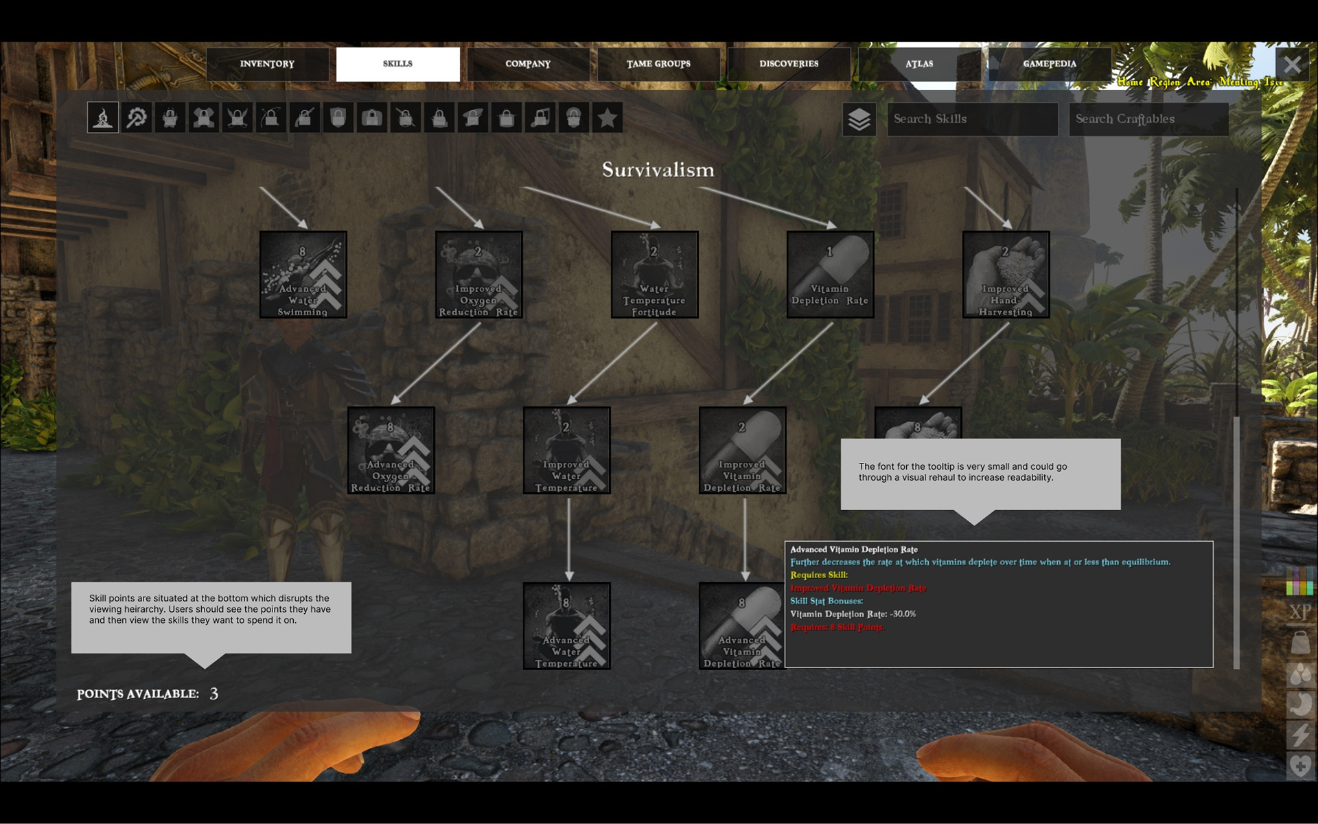
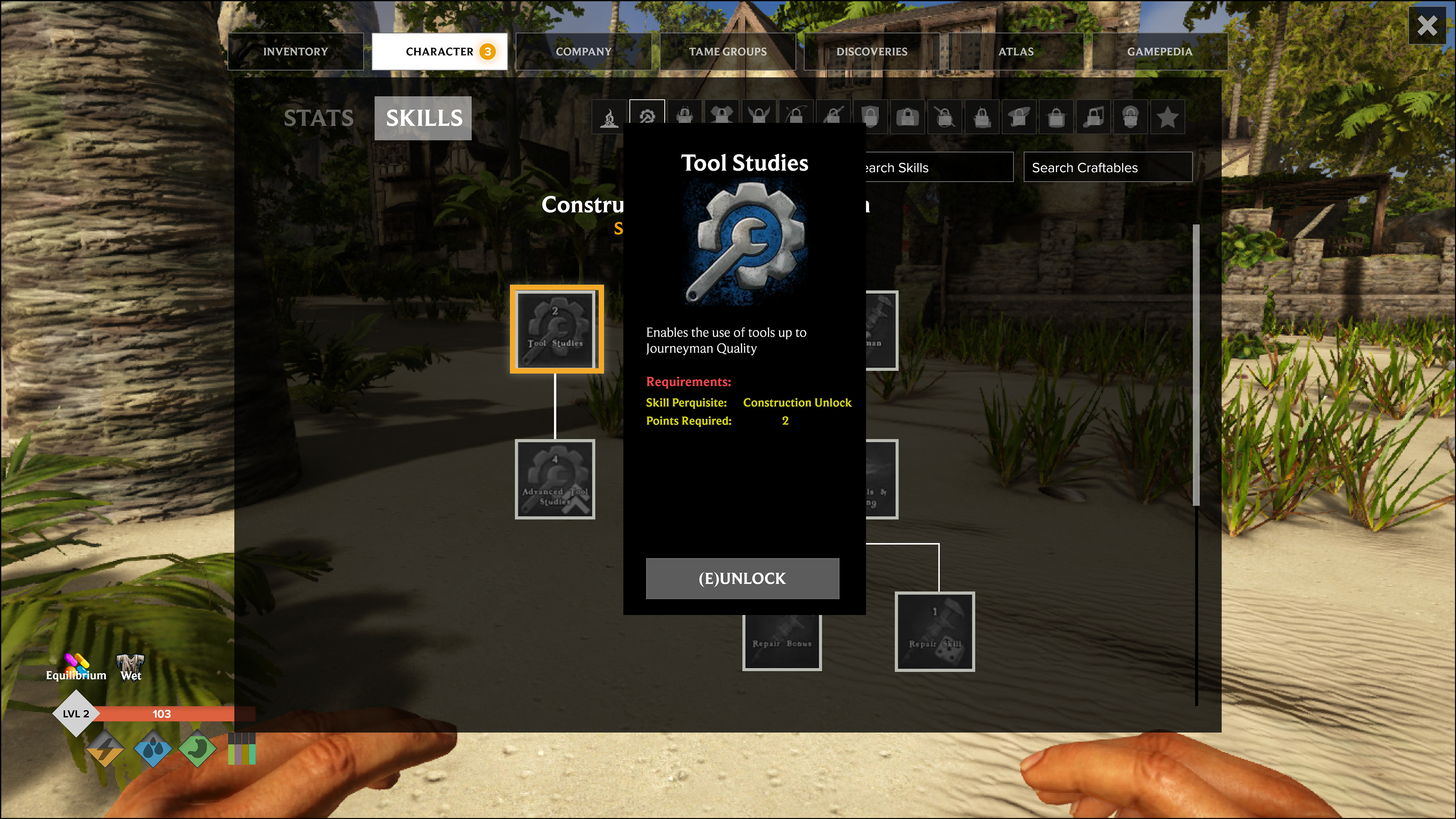
TOOLTIPS
Formulating Pain Points
After analyzing the HUD and Inventory screens, I identified the following pain points:
HUD Visibility Concerns
The HUD fades into the background, making it difficult to monitor key stats, especially during combat. This is problematic given the game’s combat focus and numerous status effects.
Cluttered Inventory Mixed with Character Level Up
The inventory screen is cluttered, detracting from item management and crafting. The character stats panel takes up too much space, increasing cognitive load. Inventory, crafting, and character upgrades should be streamlined into a single flow to reduce UI clutter, especially for console players with limited buttons.
Skill trees are visually confusing
The visual design of the skill tree is scattered, making it hard to follow progression. Skill tooltips should be larger, especially for console players where TV readability is essential.
Proposed Changes and Solutions
Began creating user flow charts to effectively address the issues mentioned above, mapping out potential solutions to improve the screens above.
Visibility of Player Status - HUD
Players should always have clear visibility of their character’s key stats. The current HUD vitals are hard to track due to their color and placement far to the right. I propose adjusting their design for easier monitoring. Additionally, on consoles with large TVs, the small HUD icons are less noticeable and should be made more prominent.
Segment Layouts and Simplify Screens
For layouts to work effectively on both PC and console, elements should be grouped by purpose. Unrelated features should be segmented or moved to reduce complexity. This segmentation helps players navigate game systems more easily and make quicker decisions by lowering cognitive load.
Wireframing
After mapping out the information hierarchy, I transitioned to wireframes, designing new greyscale layouts that directly addressed the previously identified issues, providing a cleaner, more intuitive user experience.
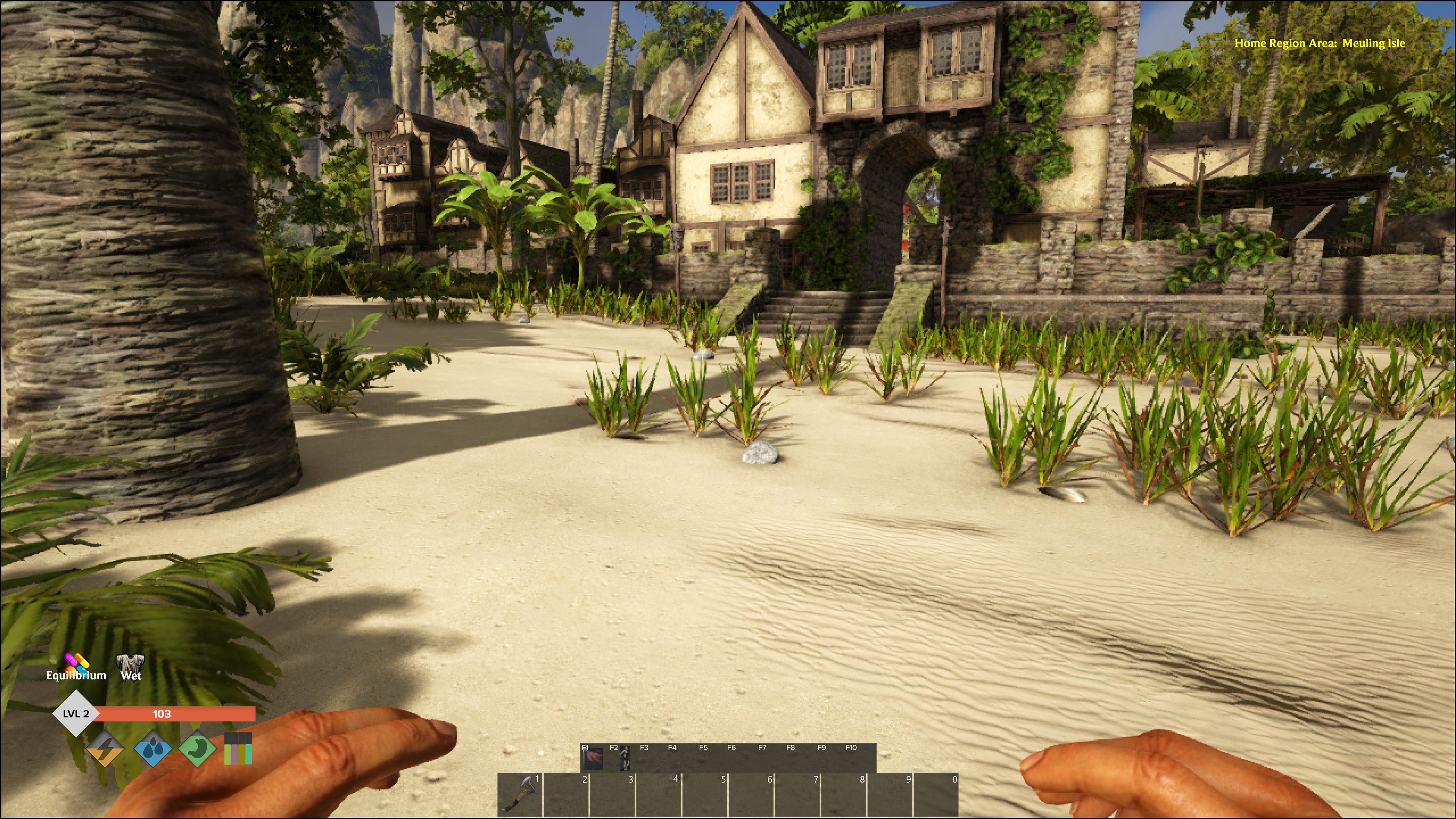
More prominent Health Bar and Status Effects
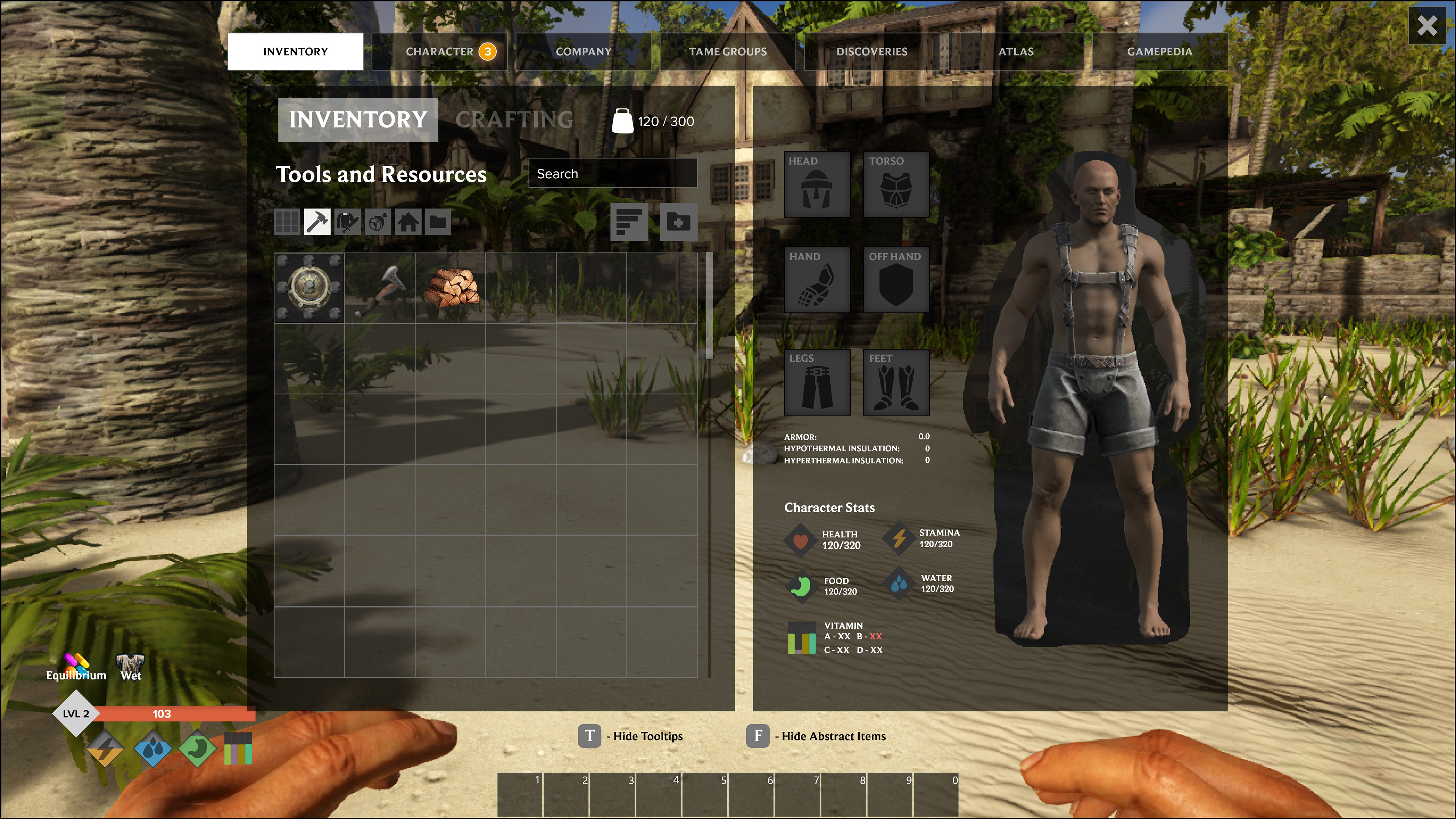
Inventory Screen with Tabs
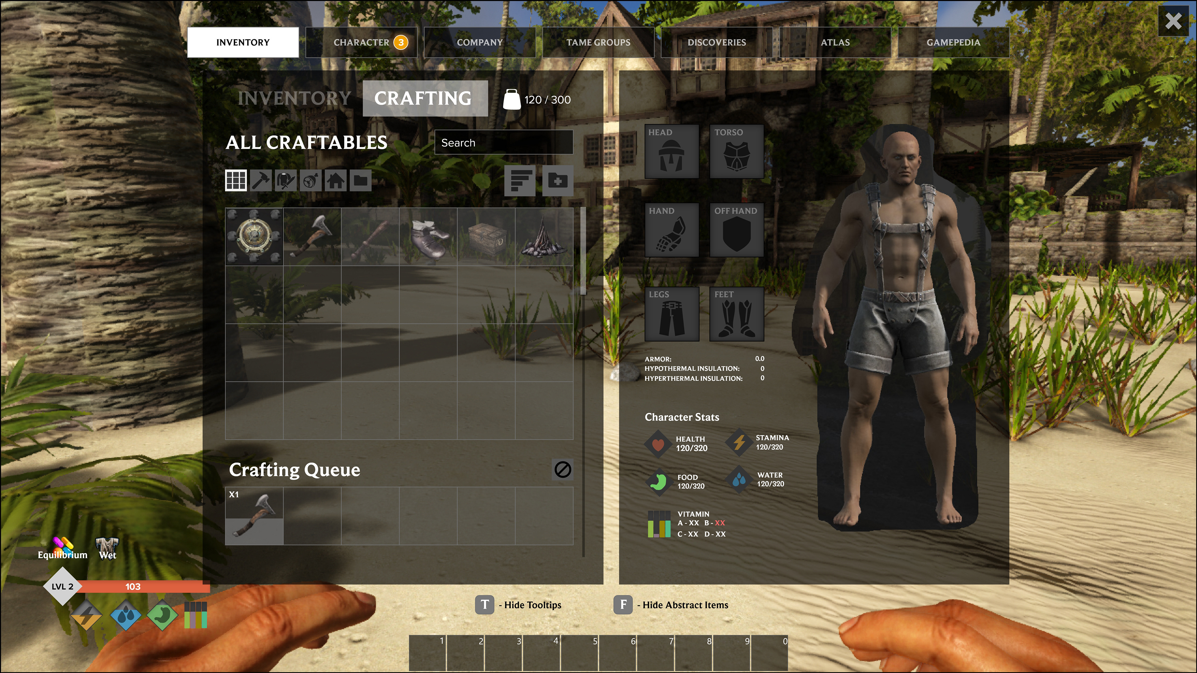
Separate Crafting Screen with Que
Separate Character Upgrade Screen
Refined Skill Tree
Refine Tooltips
Mockup Video
I created a mockup video that showcases an interactive prototype, walking through the key changes and improvements I implemented.


